Redesigning the deal creation experience for curation platform
Redesigning product interfaces always excites me because it offers an opportunity to
rethink experiences with a fresh approach.

Summary
At Media.net, I redesigned an inventory curation interface Select, focused on making it simpler, more engaging, and easier to use. Collaborating closely with cross-functional teams and users provided valuable insights, and working hands-on as an individual contributor made the project especially rewarding.
Duration
Jan-April 2025
Role
Product Designer
Tools
Figma
Team
Select
Role & Responsibilities
As a designer I was an IC for this project. I had to collaborate with 2 senior product managers and the head marketplace operations. My role was to:
Research market & analyse competitors
User test & discover user insights
Brainstorm with the product managers and developers.
Wireframe & validate
High-Fidelity Design, define design tokens & comply with accessibility standards
Select Curation Platform
Business Model
Advertisers rely on agencies to reach the right audiences, and agencies need strong insights for better ROI. Curators play a key role by creating targeted inventory packages tailored to campaign needs.

Platform
Media.net’s curation platform Select helps curators create targeting deals, view impressions insights, and manage inventory efficiently, enabling agencies to discover and buy quality publisher inventory.
Problems
Inefficient Deal
Creation
Deal creation involved multiple filters, increasing complexity and taking an average of 4.5 minutes.
Lower Platform
Adoption
The overly functional interface lacked clarity, increasing
the learning curve for curators and reducing platform adoption.
Reduced
Partnership
Growth
The unintuitive experience discouraged curator onboarding and potential partnerships.
Goal
How might we make deal creation
quicker and easier for curators?
We aimed to deliver a more engaging and intuitive interface for our curators. The approach began with refining UX details, followed by a full design revamp. Our primary success metric was reducing the time required to create a deal.

Design Research
My first step was to gather the pain points of the users. I conducted 5 user interviews on meet calls by observing how they are performing a given task.
Insights from these interviews helped me understand opportunities which I can leverage while redesigning the interface. Users were also happy with some features in the current interface which I had to retain no matter what.

5
User Interviews
4.5 mins
Creation time
11
Pain Points
14
Opportunities
Key Issues
From our research, we identified several UX gaps that were reducing deal creation efficiency and impacting curator productivity. These findings were synthesized into key themes, helping us prioritize the most critical issues and uncover opportunities for improvement.
Poor Form Experience
Cumbersome Filters
Less Appealing UI
Unclear Avails
Users found the forms long, unclear, and lacked guidance or a save as draft option making the process inefficient.

Phase 1
UX Improvisations
We took an agile approach, breaking the project into phases. In phase 1, we focused on improving UX at the component level, targeting smaller, quick-win enhancements that could be implemented and released faster.
Direct Implementation
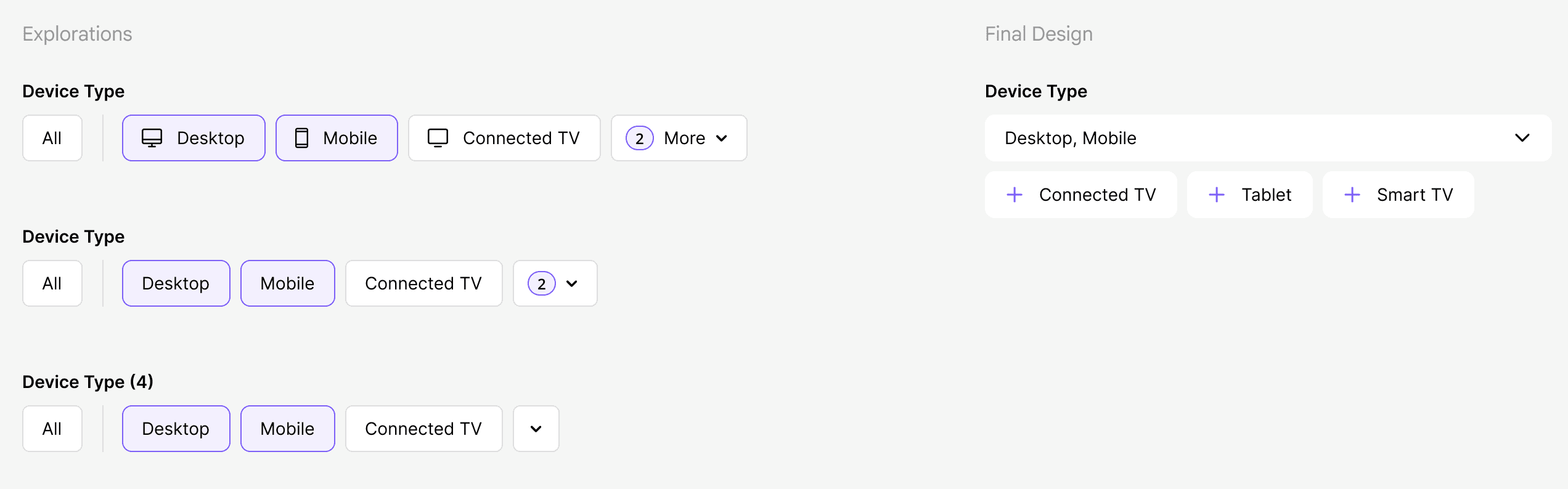
Enabled flexible date input, allowing users to either type a date directly or select it using the date picker.
Prioritized high-availability options in key targeting dropdowns, making frequently used selections easier and faster to access.
Trade-offs & Decisions
Postponed Avails Guidance improvements to a future phase due to limited development bandwidth.
Postponed Audience workflow enhancements to Phase 2 because of the complexity and implementation effort involved.
Retained the single-expanded accordion behavior in the Targeting step. While allowing multiple accordions aligns with the heuristic principle of user freedom, research showed that users preferred a more focused experience and did not perceive the current behavior as a significant issue.



Phase 1
UI Redesign
As UX improvements were being validated, we also redesigned the interface to make it more usable, engaging, and consistent. Alongside this, we built a design system to establish a unified design language across the platform.
Designed a clean, modern, and premium interface
Added contextual content for a more engaging login experience.
Optimized large-screen layouts with balanced whitespace.
Improved accessibility with WCAG-compliant color contrast.
Introduced intuitive micro-interactions for better usability.
Reduced cognitive load using compact UI components.
Design System
Initiated the creation of a unified design system Select to streamline workflows, improve UI consistency and reduce design-to-development effort. Created foundation, defined tokens and reusable components, published them as a library and synced them with storybook.

Impact
Following the Phase 1 release, we addressed the most critical usability issues in the deal creation workflow, resulting in a significantly improved user experience.
33% Reduction in creation time
Validation sessions showed higher user satisfaction and a notable reduction in creation time, from an average of 4.5 mins to 3 mins
Phase 2
Refactoring the Audience selection step was a big challenge. We wanted our users to have a simple ui where they can select segments for targeting efficiently. At the same time create custom audiences with complex expressions.
Takeaways
Working as an Individual Contributor (IC) was both challenging and exciting.
Collaborating on edge cases strengthened my design thinking skills.
Enjoyed the process of optimizing components which highlighted the importance of simplicity in design.
Simplifying complex workflows was both challenging and rewarding.
Learned that users prefer simple, intuitive experiences over unnecessary complexity.
Enjoyed improving and evolving the Design System for the product.
Designed by me. © 2026 Pooja Puthran